Minimalism continues to reign supreme in 2025. As a result, single-letter logos are now dominating logo design trends for their simple yet eye-catching look.
Among all letters, the letter B is a favorite among designers. Its structured shape, combined with its visual flexibility, gives it a balanced yet bold look that fits perfectly in the minimalist aesthetic.
Want to learn more about the power of the letter B? We got you covered. In this article, we’ll take a closer look at why B logos are so effective, where you can use them, and how you can design one for your business.
Let’s get started!
Why the Letter B Works So Well in Logo Design
Shape psychology tells us that round shapes evoke feelings of friendliness and softness, while vertical lines convey stability and reliability. The letter B contains both, making it such an effective shape.
This duality also makes it easier to pair with other letters. The letter B will look cohesive when paired with other rounded shapes like O, C, or U, or letters with vertical stems like E, F, or L. Its adaptability makes it ideal for monogram logos or initial logos.
Some more reasons why it’s so effective are:
- It has visual symmetry - The dual loops of B create a mirrored rhythm that draws the eye in and guides it naturally from top to bottom. This creates a very symmetrical, structured, and balanced look.
- It’s open for creativity - The loops of the letter also create negative space, which designers can play around with to create more creative or abstract designs.
- It’s versatile - Unlike other letters, the letter B remains recognizable even if you rotate, deconstruct, or change the shape of it. This makes it easy to transform into an elegant script, a geometric icon, or an abstract shape, while still being recognizable as the letter.
- It’s meaningful - A lot of words start with the letter B: brilliant, beautiful, beans, business, bag, etc. It’s a great letter to use especially if you’re planning to create a wordmark logo that spells out your company name.
Famous B Logos in the World
The letter B is at the heart of many iconic logos. Here are twenty iconic b logos across luxury, automotive, media, and tech:
Balenciaga

Fashion house Balenciaga uses narrow and bold sans-serif lettering for its logo to convey minimalist elegance. This typography, combined with a monochrome color palette, creates a logo that boasts an elegant and timeless look.
Hugo Boss
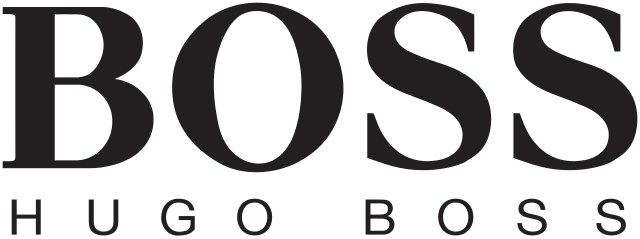
Hugo Boss, with its predominantly male target audience, opted for a bold and masculine lettering style for their logo design. It’s then balanced out with a thinner and sleeker wordmark below to create a powerful yet sophisticated look.
Burberry

Burberry's recent logo design change brought about a completely different vibe to their brand. They still use an elegant font, but added some playful serifs and slightly flared bars. This retains the traditional feel of their brand while making it more modern and fresh.
Breitling
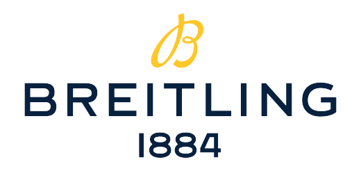
Breitling features a flowing, script-style B icon to reflect precision and motion. This is in line with their brand’s core values, which are all about creating high-quality and high-performance watches.
Balmain
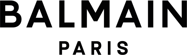
Balmain uses a strong geometric B in a circle to suggest timeless style. The B icon is also a creative play with letters. If you look closely, you’ll see it's a combination of B and P. B for Balmain, and letter P for Paris and Pierre (the founder's name).
Bugatti
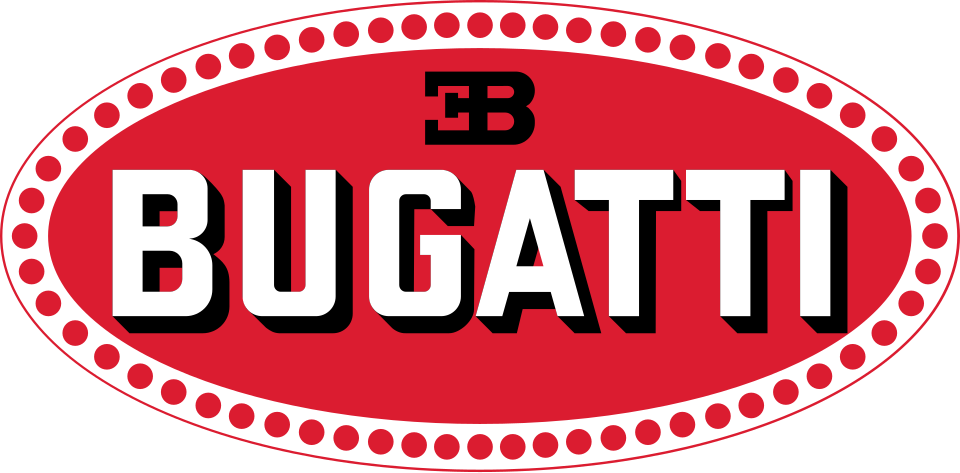
Bugatti’s most iconic logo version features their wordmark inside a red and gray badge to symbolize speed and luxury. They also used a symbol of letter E and letter B standing back to back, which was a nod to the owner, Ettore Bugatti.
BMW
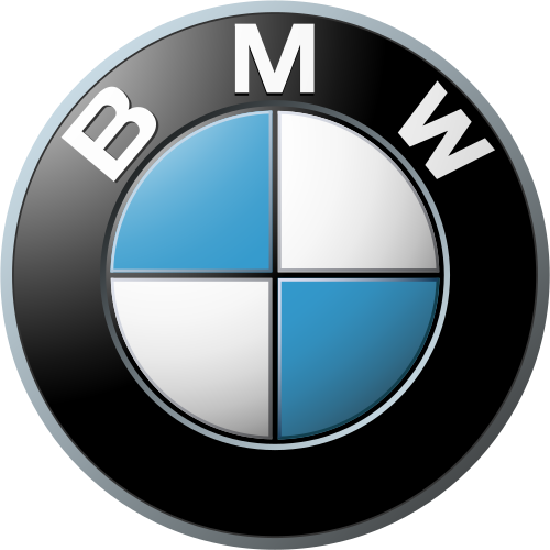
The most distinct BMW logo version features the letter B as part of a balanced and symmetrical badge. The logo looks clean, luxurious, and professional, which fits well with the BMW branding.
Bentley
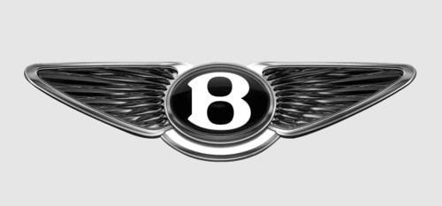
Bentley features a capital B decorated with intricate gray wings. It’s meant to reflect prestige, heritage, and speed. The logo also references the brand's beginnings, as it was originally an aircraft parts maker.
Buick
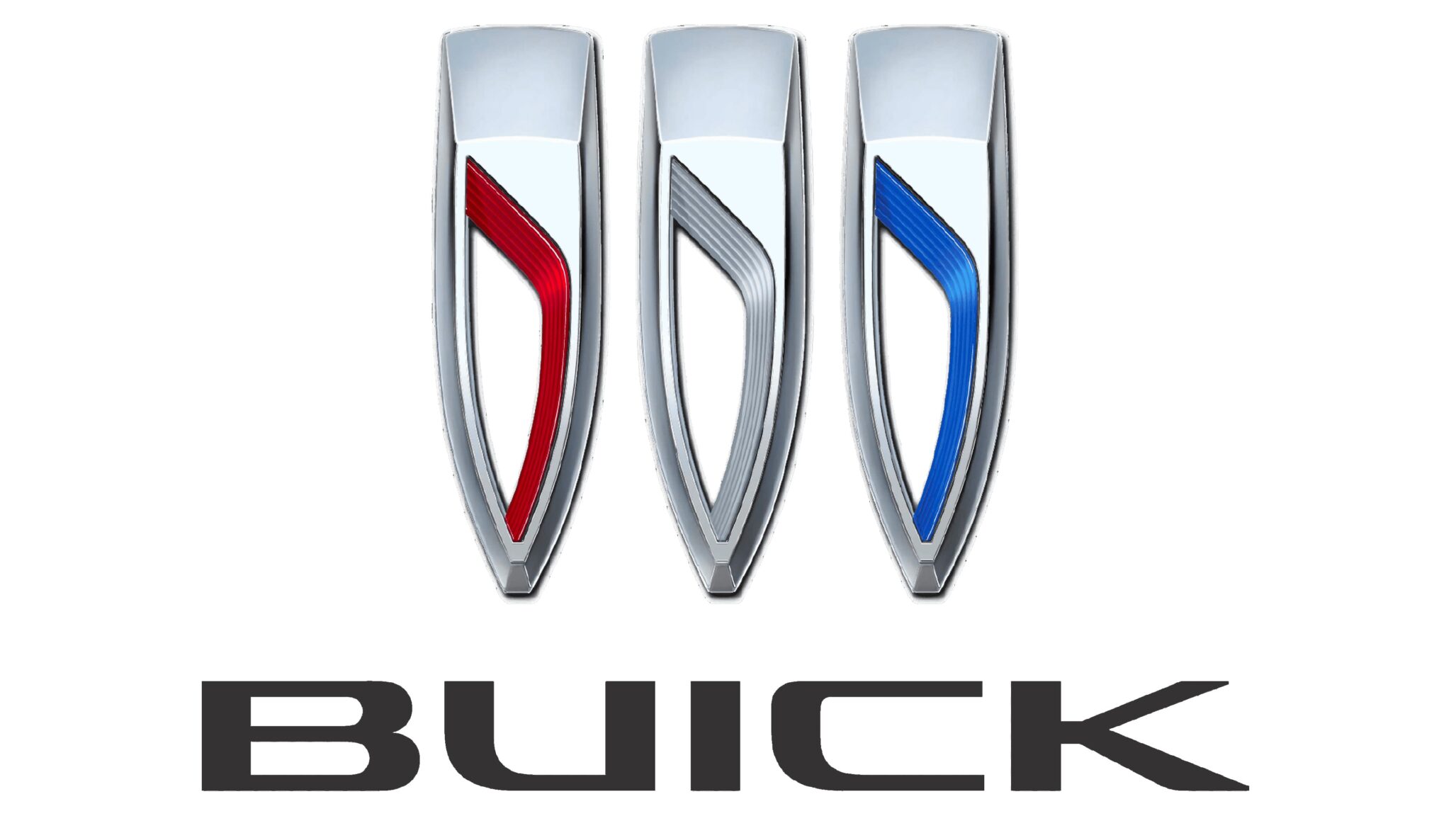
The new Buick logo features a modernized take on its famous emblem. It now has a more silver surface and fewer color elements to fit with the minimalist trend. The wordmark was also changed to a more geometric and brutalist-style font to look more modern and powerful.
BYD
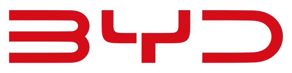
Electrical car manufacturer BYD went for an elongated futuristic font for their logo design, to fit with their ultra-modern and high-tech branding. They also used a bold red palette to convey their progressive and innovative ideas.
BTS

Kpop group BTS uses a simple yet bold logo design by combining a wordmark of their group name with a door-like shape above it. The symmetry and strong geometric lines makes this a very visually balanced and eye-catching logo.
BBC

This iconic logo features bold uppercase Bs and the letter C in black boxes for a clean, authoritative, and timeless look. This design fits with their position as one of the world’s largest and oldest broadcasting networks.
BuzzFeed
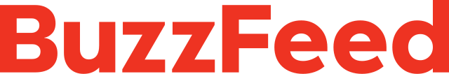
BuzzFeed may be a news and information platform, but it is definitely more casual than the others. This is why it uses a rounded and playful wordmark plus a lot of lowercase letters to look more casual and approachable. Meanwhile, the bold red color signifies energy and innovative thinking, which is perfect for the often viral media outlet.
Bumble

Bumble’s logo design fits with the promise of the app. The bright yellow palette and the hexagon shape convey energy and enthusiasm, plus tie in with their bee theme. Their typography also reinforces this casual and happy branding, with the lightweight and rounded sans-serif font.
Baidu
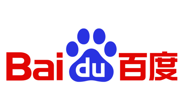
Baidu is a Chinese tech company that develops search engines, maps, and online encyclopedias, among others.
Their logo features red lettering of their company name in both English and Chinese. It also has a paw print in the middle. Aside from making it a bold design choice for the typical straight-laced logos in the tech industry, it also cleverly ties a dog’s excellent tracking ability to their search engine.
Bose
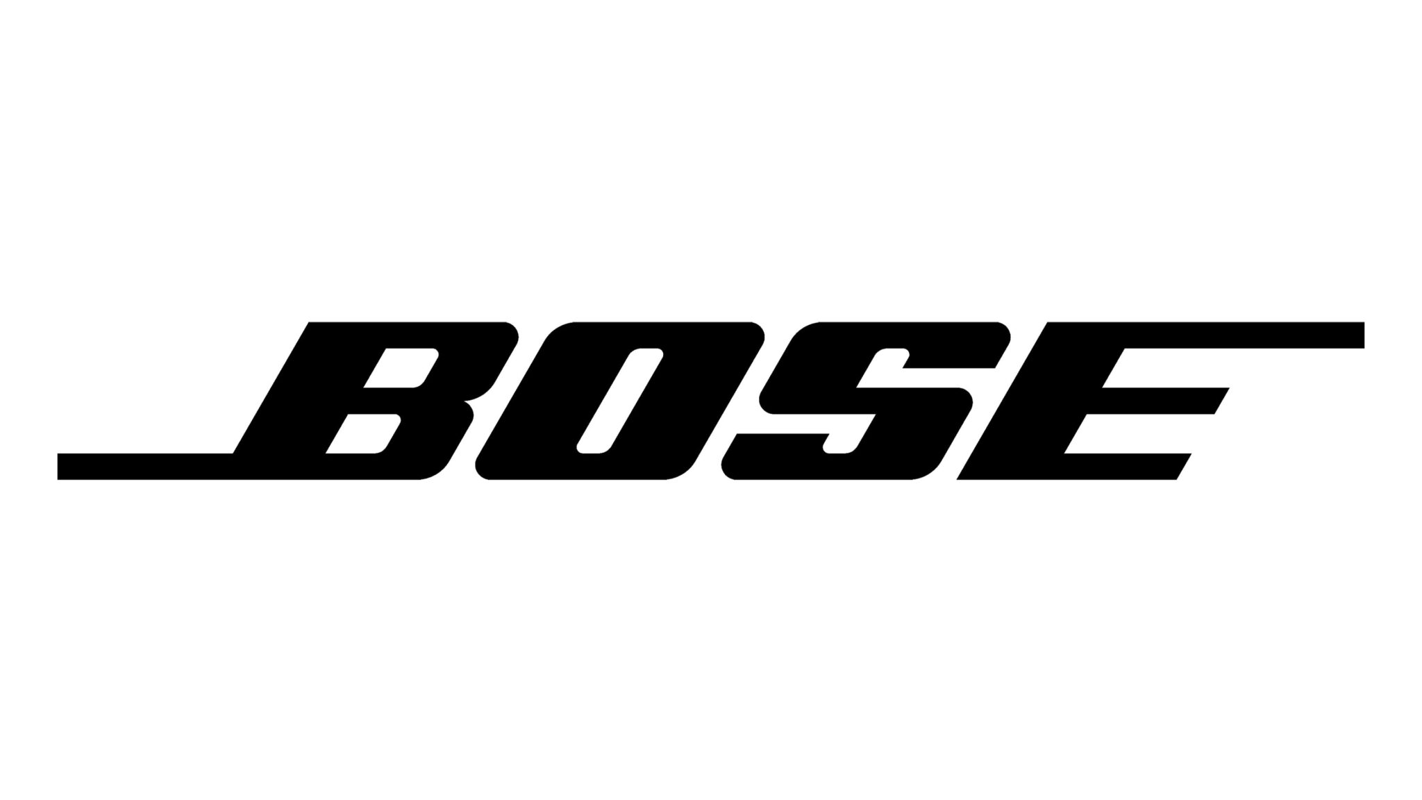
Bose’s logo uses an italic wordmark with extended lines to symbolize motion and forward-thinking. Meanwhile, the sleek and bold lettering gives it a premium and elegant feel.
Bosch
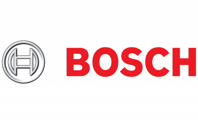
The solid and bold font of the Bosch logo makes it look clean and trustworthy. The color scheme represents confidence and professionalism, which is in line with Bosch’s high-quality and reputable image.
Beats by Dre
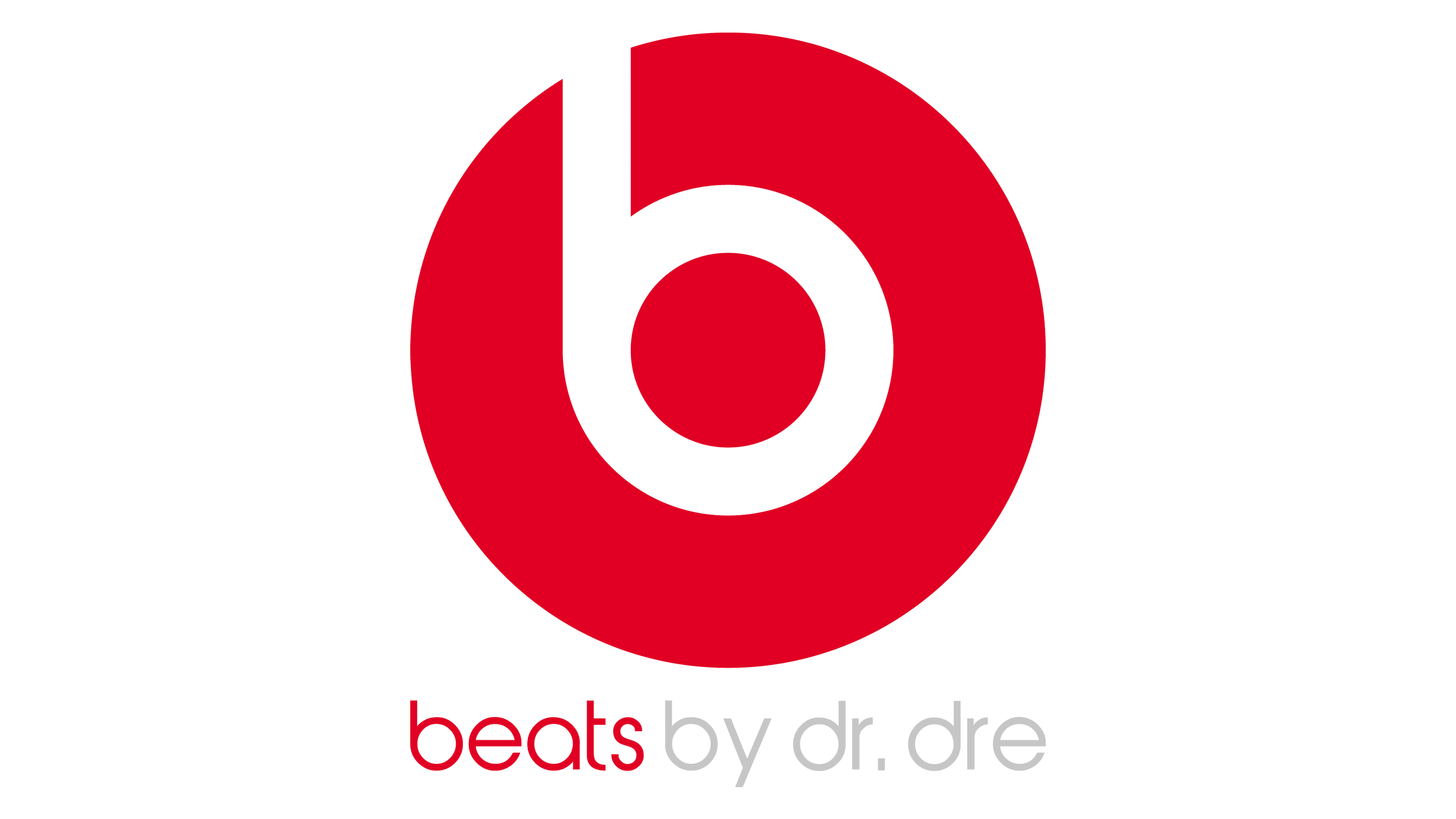
This iconic Beats logo creatively uses the letter b. It was meant to mimic both a headphone and the B in Bose, fitting for the company’s product and name. The result is a fresh logo design that everybody can recognize.
Bang & Olufsen
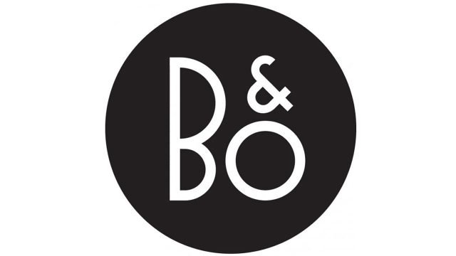
This logo design is another creative play on the letter. This time, the B was inverted to symbolize that the company’s innovative products have turned the world of music around.
Bluetooth
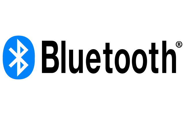
Probably the most iconic B symbol of all time, the Bluetooth icon is actually a stylized Nordic rune that spells out “HB” for Harald Bluetooth. If you didn’t know, Harald Bluetooth was a Danish king known for uniting tribes into one nation, which relates to the connecting power of a Bluetooth device. Clever, isn’t it?
Logo Design Tips for a Beautiful B Logo
So, how do you craft a beautiful and effective B logo? Here are our top tips:
Understand your brand personality
Your logo represents your brand. Therefore, to create a great logo, you need to first understand what your brand is all about and what you want to be known for.
Do you see your brand as fun and playful? Smart and practical? Premium and high-quality? Or creative and dynamic?
This should give you a better idea of what your logo design should be.
Pick a visual style
Now that you know your brand personality, it’s time to pick a visual style to match it.
For example, elegant or minimalist designs will work well for luxury brands. Meanwhile, abstract logos that play around with negative space might work for innovative brands like tech or creative agencies.
Play around with the shape
Speaking of the negative space, don’t be afraid to play around with the spaces of the letter. For example, you can add eyes to the loop or shape it into a leaf or coffee bean.
You can also experiment with symmetry and geometry. You can make the two loops reflect each other, intersect with other letters like the Balmain emblem, or make the shapes as structured and sharp as possible.
Your typography matters
The lettering style or type anatomy for the letter B can dictate the vibe and feeling of the logo.
For instance, serif fonts can make your logo look more traditional and luxurious. Meanwhile, sans-serif fonts can look modern and clean.
Even the spacing and arrangement of the letters can affect your design. Letters with huge spaces between them can look more airy and approachable, while letters squeezed together can look sharper and futuristic.
Letters angled to the right can mimic motion, while letters with no clear arrangement can be artfully done for a brutalist look.
Use color psychology
The color palette you choose can also affect how your logo will be perceived. For example, blue is seen as reliable and trustworthy, red is seen as bold and passionate, while yellow is known as happy and friendly. Make sure to brush up on color psychology to ensure that your color choice is the most optimal for your desired look.
Consider your brand name
Short names paired with a strong and bold B logo design can give maximum visual impact. Meanwhile, an initial B can be stylized into an intricate crest for a more elegant look.
Even the name of your company can also affect your design. For instance, alliterative names like BrightBridge or Bloomin’ Blues can lend to more geometric layouts.
Don’t have a name yet? Hop on to our business name generator now, and we’ll give you catchy names that start with a letter B to choose from. Who knows, this just might be the start of your iconic logo!
Best Tools To Create a Beautiful B Logo
Is your mind now buzzing with ideas for your B logo? If you want to bring your vision to life, here are our top recommendations for tools to create your logo:
Logo templates and AI logo generators
Don’t have any design skills? Don’t worry—BrandCrowd offers customizable logo templates. You can access premade logos, which you can edit to fit your needs. There's no need to start from scratch! The editor is also a simple drag-and-drop tool, so even non-designers can edit with ease.
Want to make the process even quicker? Design.com offers an AI logo generator that will give you finished logo designs based on your keyword or company name. The AI also ensures that the logo choices it gives you are on-brand and in line with your industry’s current trends.
Design software
If you want more control over your design, then design software is the way to go. Tools like Adobe Illustrator can let you adjust even the most minor details, like how long your B’s stem should be or how circular the loop is. This enables you to produce logos that are 100% in line with what you want instead of being limited by the available templates.
However, since you are DIYing this, it would take more time and effort to finish a design. You’ll also be limited to what you can do with your editing knowledge.
Font resources
The typography of your letter B has the biggest impact on your design.
If you want to make this part easier, you can go to Creative Market, Envato, or Google Fonts to find thousands of typefaces in various styles.
You can then download the fonts and use that for your design instead of coming up with a custom typeface from scratch.
These platforms also offer a monogram style font, where the letters are already styled into a logo shape to make customizing easier.
Crowdsourced design
Want a more professional touch? You can post a design contest here at DesignCrowd. This would give you a chance to have multiple professional designers have their take on your B logo. Once you choose your favorite design, you just need to pay the designer, and boom, you have your logo!
Industry-Based B Logo Inspirations
Need more inspiration for your B logo? Here’s how you can adapt the letter for various industries:
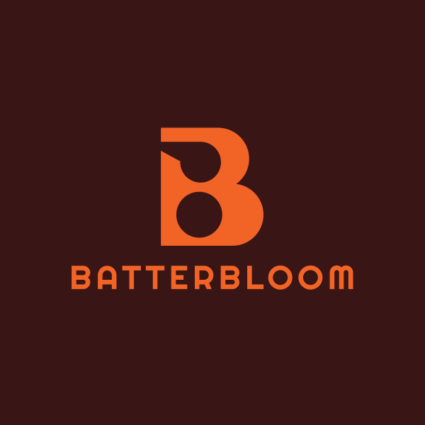
Boutique bakery
Warm and personal designs work best for bakeries. You can try using a script lettering or a handwritten logo to mimic that hand-made touch. You can also use warm, earthy tones like caramel brown, soft yellow, or terracotta to evoke that cozy feeling.
Castle Tower Letter B by Design.com
Generic Business Letter B by BrandCrowd
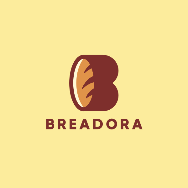
Bread Bakery Letter B by Design.com
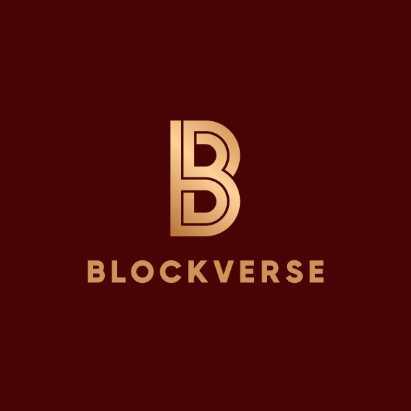
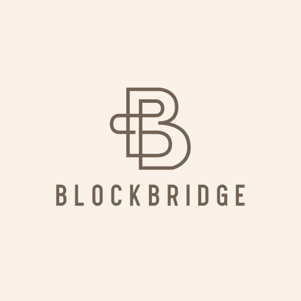
Blockchain startup
For tech companies, B can be stylized into sharp geometric shapes to form cubes or chain links. You can also pair it with cool-toned colors like ice blue, deep violet, or silver to add a futuristic or cyberpunk vibe to your design.
Modern Elegant Letter B by Design.com
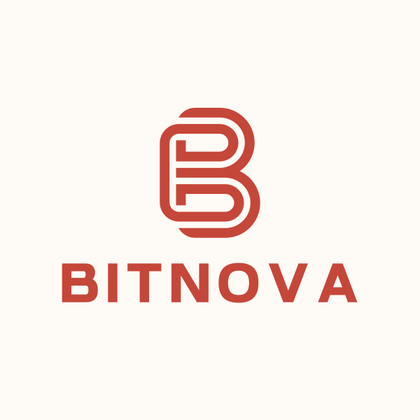
Stripe Letter B by BrandCrowd
Generic Business Letter B by Design.com
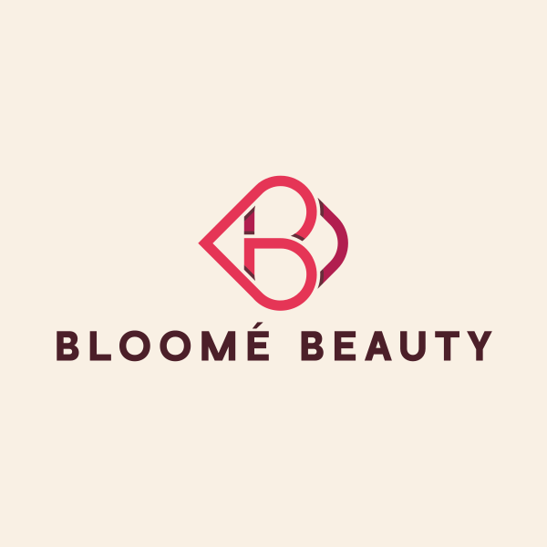
Beauty brand
Beauty logos favor elegant and feminine designs. A flowy script or an intricate B monogram can work wonderfully, especially when paired with floral icons, abstract swirls, or soft pastel gradients.
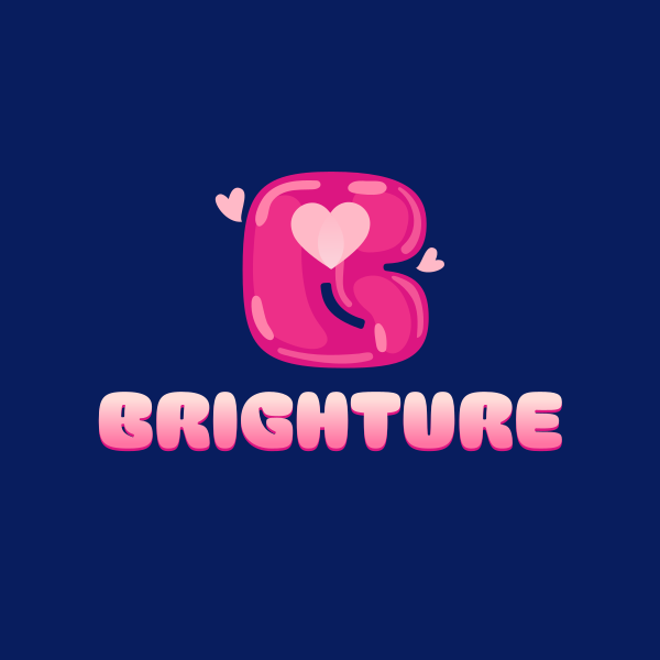
Heart Love Letter B by Design.com
Minimalistic Stroke Lettermark by BrandCrowd
Creative Studio Letter B by Design.com
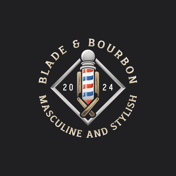
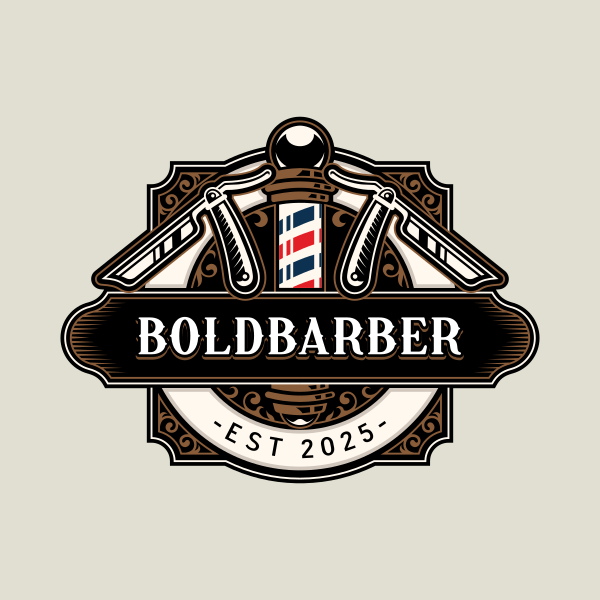
Barbershop
Vintage designs are more fitting for barbershops. Try using a retro font for your B and integrating it into a badge or crest for a more old-school look. A black, white, blue, and red palette is also ideal, as it references the iconic barber’s pole.
Razor Grooming Barbershop by Design.com
Razor Barbershop Haircut by BrandCrowd
Barbershop Groomer Scissors by Design.com
Business consulting firm
A strong, bold, and clean sans-serif font will work best for consulting firms, indicating professionalism and authority. Don’t add too many flairs or colors, as it can just be distracting and make your firm look childish. If you want to add visual elements, go for subtle arrows, forward slashes, or structured rectangles for a more understated look.
Generic Studio Business by Design.com
Generic Business Company by BrandCrowd
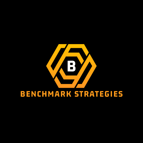
Finance Business Hexagon Startup by Design.com
Trends in Monogram Logos and Lettermark Design for 2025
Looking for fresh design ideas? We’ve compiled the current trends in the monogram and lettermark design sphere for your inspiration below.
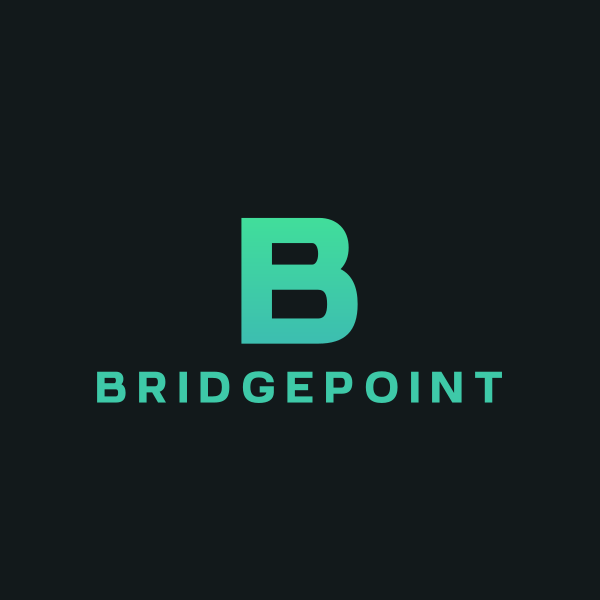
Gradient or metallic lettermarks
Gradient and metallic coloring add a depth of sophistication to B logos. These are perfect for the tech or beauty industry, where a high-quality feel is important.
Startup Modern Letter B by Design.com
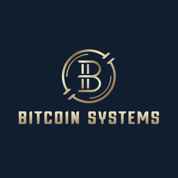
Crypto Currency Letter B by BrandCrowd
Boutique Artisan Letter B by Design.com
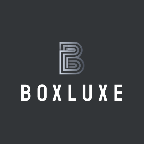
Ultra-minimal B monograms
These logos feature clean lines, abstract concepts, or stripped-down geometry to convey clarity and elegance.
Professional Elegant Letter B by Design.com
Simple Business Letter B by BrandCrowd
Letter B Marketing Studio by Design.com
Animated or dynamic B logos
These logos feature subtle animation like morphing shapes, glow or shadow effects, and intersecting letter motion. Dynamic b logos that feature 3D designs, layered gradients, or creative perspectives also add a sense of movement without using actual animation.
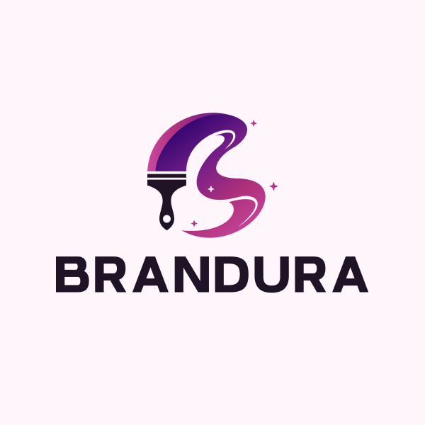
Creative Painter Letter B by Design.com
Heart Love Letter B by BrandCrowd
Colorful Abstract Letter B by Design.com
Create Your Signature B Logo Today
The letter B is an adaptable and versatile visual element that can serve as a foundation for a distinct brand identity. Whether you’re a fashion label, tech startup, or automotive brand, you can surely create a B logo that is suitable for your brand identity.
Luckily, creating a logo doesn’t have to be hard. You can use our AI logo generator, logo templates, or start crowdsourcing on DesignCrowd. You can even experiment with other letters, like letter R or letter P, to jog your creative mind further.
Who knows, you just might create a bold and brilliant B logo that will be remembered for years to come!
Faviola Publico is an SEO Content Writer specializing in branding and digital marketing strategies. Outside of work, she enjoys reading slice-of-life novels and watching any mystery thriller-themed series.
Header Artwork by Selwyn Legaspi
Written by DesignCrowd on Thursday, August 28, 2025
DesignCrowd is an online marketplace providing logo, website, print and graphic design services by providing access to freelance graphic designers and design studios around the world.
