Infographics have been around for years, yet they still manage to pull attention in a world where people scroll faster than they blink.
That’s not luck. It’s design.
A well-made infographic can stop the scroll, simplify complicated ideas, and make your content instantly more shareable. It can also help you earn backlinks, build authority, and drive consistent traffic long after it’s published.
But here’s the catch: most infographics are boring.
They’re cluttered, overly technical, hard to read, or they look like someone copied and pasted a spreadsheet into a Canva template and called it a day.
If you want your infographic to actually attract attention (and not just exist), you need to approach it with strategy, not just aesthetics.
Let’s break down how to design infographics that people want to look at, share, and link to.
Why Infographics Still Capture Attention
Infographics aren’t popular just because they look nice. They’re popular because they make information easier to process.
In a world full of content overload, clarity wins.
The psychology behind visual content
The human brain processes visuals faster than text. That means charts, icons, and bold headlines can communicate meaning instantly, even if someone only glances at your content for a few seconds.
Infographics also tap into something powerful: pattern recognition.
When people see a well-organized graphic, their brain automatically tries to follow the flow. If the layout is clean, the reader stays engaged longer. If it’s chaotic, they bounce immediately.
Good infographic design uses:
- contrast to guide attention
- hierarchy to show what matters most
- spacing to prevent overwhelm
- storytelling to keep the reader moving
In short, it makes the reader feel smart, not stressed.
When infographics work best
Infographics aren’t the right fit for every topic, but they shine when you’re working with:
- statistics and research data
- step-by-step guides
- comparisons (A vs. B)
- timelines
- frameworks or processes
- industry trends
If your content can be explained faster with visuals than with paragraphs, it’s infographic material.
In 2026, the line between graphics and video is blurring.
If your data has a "timeline" or "process," consider a short interactive video or an audio-reactive snippet. Much like an infographic, interactive video allows users to "choose their own adventure" through your data, keeping them on your page longer, which is a massive signal for search engines.
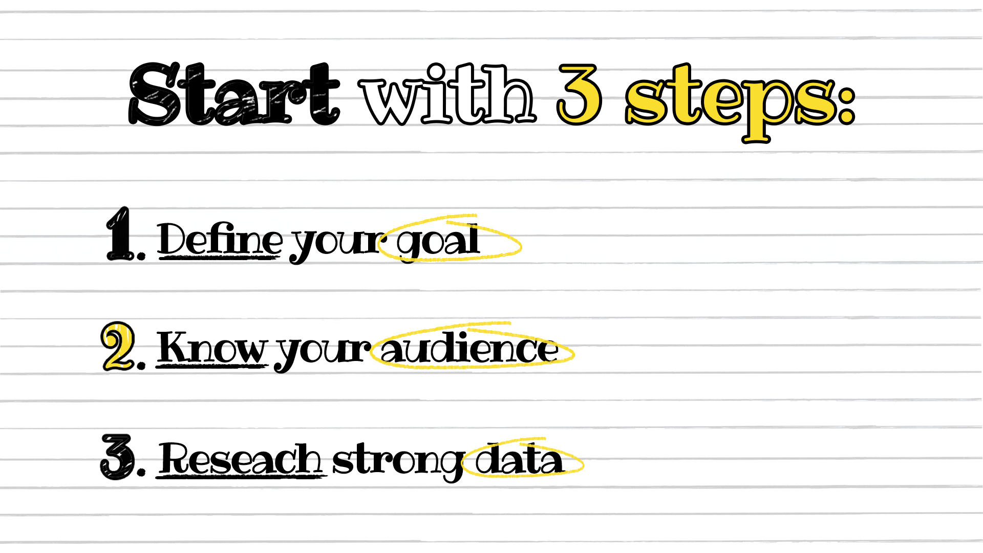
Start With Strategy, Not Design
A lot of people open a design tool and start dragging icons around before they’ve even figured out what the infographic is supposed to say.
That’s how you end up with a pretty design that communicates nothing.
Start with the message first.
Define your goal
Every infographic should have one primary goal. Not five.
Your goal could be:
- educating an audience
- getting shares on social media
- supporting a blog post
- earning backlinks from other websites
- generating leads for a product or service
Once you define the goal, you can design with intention.
If the goal is backlinks, you’ll want original data, credible sources, and a layout that feels “citation-worthy.” If the goal is social shares, you’ll want something punchy, bold, and highly skimmable.
Know your audience
Design decisions should depend on who will be viewing the infographic.
Ask yourself:
- Are they beginners or experts?
- Are they on mobile or desktop?
- Are they marketers, business owners, or students?
- Are they looking for quick tips or deep data?
A beginner audience needs simple explanations and clean visuals. An expert audience might want more detail and stronger data points.
Either way, the design should never feel confusing.
Research strong data
Your infographic is only as good as the information inside it.
If you want attention, you need one of these:
- surprising statistics
- useful insights
- actionable steps
- unique angles on familiar topics
Whenever possible, use credible sources like government sites, academic research, or well-known industry publications. If you include statistics, cite the source clearly in small text near the bottom of the infographic.
If your data feels trustworthy, people are far more likely to share and link to it.
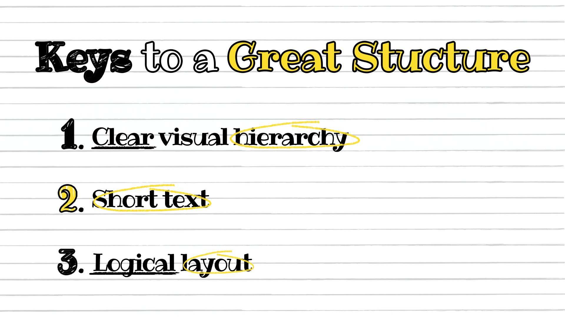
Structure Your Infographic for Maximum Impact
The best infographics don’t just look good. They read smoothly.
Think of your infographic like a story. It should guide the reader from point A to point B without confusion.
Create a clear visual hierarchy
Visual hierarchy is what makes someone notice the right things in the right order.
Your infographic should include:
- a strong title at the top
- clear section headers
- bold emphasis on key numbers or takeaways
- consistent spacing between sections
The reader should be able to scan your infographic and instantly understand what it’s about.
If your headline doesn’t pop, your infographic won’t either.
Keep text short and powerful
Infographics are not blog posts.
If you have long paragraphs, you’re doing it wrong.
Instead of full sentences, use:
- short phrases
- bullet-style explanations
- simple labels
- quick takeaways
Aim for bite-sized content that works even for someone who’s only reading half of it.
Also, make sure your text is written in plain language. Avoid jargon unless your audience expects it.
Use a logical layout
Most infographics work best in a vertical format because it fits blog posts, Pinterest, and scrolling behavior.
A clean layout usually follows this flow:
- Title
- Introduction statistic or hook
- Main sections (broken into blocks)
- Summary or key takeaways
- Sources and branding
Keep the direction obvious. If the reader has to guess where to look next, you’ve already lost them.
White space is your friend. Use it.
Choose Colors and Typography That Demand Attention
Color and typography are the fastest ways to make an infographic feel professional or amateur.
People judge credibility in seconds, and design plays a huge role in that.
Stick to a cohesive color palette
A common mistake is using too many colors. It makes the design feel messy and overwhelming.
Instead, choose:
- 1 primary color
- 1 secondary color
- 1 accent color
- neutrals (black, gray, white)
Color should support the message, not compete with it.
Use contrast for readability. Light text on a light background is a fast way to lose attention.
Select fonts that enhance readability
Typography can make or break your infographic.
Stick to two fonts:
- one for headings
- one for body text
Avoid decorative fonts unless they’re used sparingly. Your infographic should be readable on both desktop and mobile.
Also, pay attention to font size. If someone needs to zoom in, they won’t bother. They’ll scroll past.
Design for Shareability
If you want attention, you need to design for how people actually consume content.
Spoiler: they don’t read carefully.
They skim.
Make it skimmable
Your infographic should be understandable even if someone only reads:
- the title
- the subheadings
- the bold numbers
That means your key points should stand out visually.
Use elements like:
- icons
- charts
- highlighted callout boxes
- big numbers
If you can’t summarize your main point in a few visual blocks, the infographic is probably too complicated.
Optimize dimensions for platforms
Different platforms favor different formats.
Here are some general guidelines:
- Pinterest: tall vertical graphics perform best
- LinkedIn: square or slightly vertical designs work well
- Instagram: 4:5 ratio is ideal, or break the infographic into a carousel
- Blog posts: vertical layouts are easiest to embed and read
If your infographic is long, consider creating smaller versions for social media.
One infographic can become 10+ pieces of content if you design smart.
Add your branding subtly
Branding matters, but nobody wants to share a giant advertisement.
Include your branding in a subtle way:
- logo in the footer
- small URL at the bottom
- consistent brand colors
This ensures people remember where it came from without feeling like they’re promoting you.
Turn Infographics Into Backlink Magnets
Infographics aren’t just for aesthetics. They can be serious SEO assets.
When done right, they can generate backlinks naturally because they’re easy to reference, embed, and cite.
Why infographics earn links
Writers, bloggers, and journalists love visuals because they make their content stronger without extra effort.
If your infographic includes:
- unique stats
- original research
- a clear explanation of a trend
…then it becomes a resource.
And resources get linked.
Infographics are especially powerful when paired with a strong outreach strategy. If you want to build authority and improve rankings, it helps to combine infographic creation with proven link-building tactics.
That approach can turn a single infographic into a long-term traffic generator.
Outreach strategies that work
If you want your infographic to attract attention beyond your own audience, you’ll need promotion.
Some effective outreach strategies include:
- emailing bloggers who cover similar topics
- reaching out to journalists who write about your niche
- offering the infographic as a visual “bonus” for an existing article
- pitching it as a data resource for roundup posts
Make it easy for people to share your infographic by providing an embed code.
Also, personalize your outreach. Nobody wants a generic “Hey, I made an infographic, please share it” email.
Repurpose for multiple channels
Infographics work best when they’re not treated as one-time assets.
You can repurpose them into:
- blog post sections
- social media carousels
- YouTube video visuals
- email newsletter content
- slide decks
- bite-sized stat graphics
The more places it appears, the more attention it attracts.
Common Infographic Design Mistakes to Avoid
Sometimes the fastest way to improve your infographic is to stop doing what everyone else is doing wrong.
Overcrowding with data
It’s tempting to cram everything into one graphic.
Don’t.
If your infographic feels like a wall of text, it defeats the purpose.
Focus on the most important insights. Cut anything that doesn’t support the main message.
Weak headlines
Your infographic title needs to hook attention instantly.
Bad titles look like:
- “Marketing Statistics”
- “Social Media Data”
- “Infographic About SEO”
Better titles create curiosity, like:
- “7 Surprising SEO Stats That Explain Why Rankings Change”
- “The Real Cost of Bad Branding (With Numbers)”
- “How Attention Spans Have Changed in the Last 10 Years”
A strong title can do more for engagement than any design element.
Poor mobile optimization
Many people will view your infographic on their phone.
If your text is tiny, your charts are cramped, or your layout is too wide, the infographic becomes unusable.
Always preview your design on mobile before publishing.
If it’s hard to read on a small screen, simplify it.
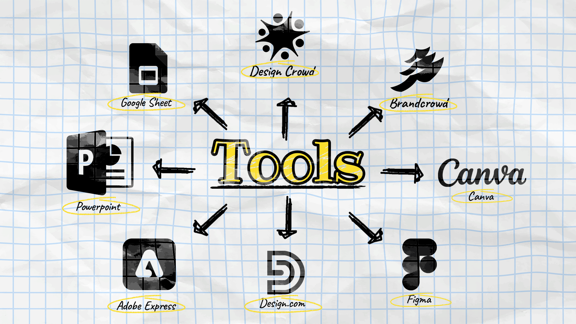
Tools That Simplify Infographic Creation
You don’t need to be a professional designer to create an effective infographic. What matters most is choosing a tool that matches your workflow and using it well. A strong infographic depends on clear hierarchy, good spacing, readable typography, and a layout that helps people understand the information quickly.
Here are a few popular tools worth considering:
- Canva is one of the easiest options for beginners. It is especially good for infographics because it offers a large library of ready-made templates, drag-and-drop editing, built-in icons, charts, and visual elements that make it simple to turn information into something polished. It is a strong choice when you want to create something fast without starting from scratch.
- Figma gives you more control over layout, spacing, and visual systems. It is great for infographics when you want a more custom, modern, and brand-consistent result. Because it is built for design flexibility, it works well for teams that want to fine-tune every element, create unique compositions, or collaborate in real time.
- Adobe Express is useful for lightweight design work and quick content creation. It works well for infographics because it combines ease of use with a more polished visual feel, making it a good middle ground between beginner-friendly tools and more advanced design platforms. It is especially helpful for social-ready visuals and branded content.
- PowerPoint and Google Slides are practical choices for simple infographic-style visuals. They are surprisingly useful for infographics because they make it easy to arrange text, shapes, icons, and charts in a structured way. If you are already comfortable using presentation software, they can be a fast and familiar way to create clean, informative graphics without learning a new design tool.
- Design.com’s AI presentation maker is another useful option, especially if you want to create visually polished presentations and infographic-style slides quickly. It is good for infographic creation because it is built around accessible templates and easy customization, helping non-designers produce branded, professional-looking visuals with less effort.
- BrandCrowd’s presentation maker is also worth considering if you want ready-made design assets and presentation layouts. It is helpful for infographics because it gives you a fast starting point with editable templates, making it easier to assemble visual content that looks cohesive and professional.
- If you want more advanced support, DesignCrowd is a strong option for professional infographic services. Instead of building everything yourself, you can work with freelance designers who can create a custom infographic based on your content, goals, and brand style. This is especially useful when you need something more original, more polished, or more strategic than a template-based design.
Final Thoughts
If you want to design infographics that attract attention, don’t start with colors or icons.
Start with clarity.
A great infographic has a strong message, a logical structure, and visuals that guide the reader effortlessly. It’s skimmable, readable, and built for the platform it’s shared on.
And when you combine good design with smart promotion, an infographic becomes more than content.
It becomes an asset.
So keep it simple, make it useful, and design like your audience is scrolling fast—because they are.
Written by DesignCrowd on Friday, April 10, 2026
DesignCrowd is an online marketplace providing logo, website, print and graphic design services by providing access to freelance graphic designers and design studios around the world.
