What's typography in relation to graphic design? Our working definition is: "Typography refers to the visual design of language through the selection of type font, size, line, and spacing" - from
Multimodal Glossary.
Typography is the easiest way of communicating an idea and message, it's very important for the designers of today to know how to mould and make typography their own. Leading design academic, Hartmut Stöckl, suggests that there is a clear method to the creation of typography, and you can conclude that if you neglect a part of this "grammar" you haven't utilised typography in the truest sense of the word. Example: Just as there is no speech without voice qualities and intonation, Stockl argues that there is no written document without (typo)-graphic qualities. In this 4 part blog series, I will attempt to explain this 'grammar' and get you thinking differently about type by giving a breakdown and a few tips that I find handy when creating anything that has text on it, from a logo to a billboard to a booklet.
Letterforms
This is all about how the letter looks and this is what you should be thinking about first. This is all about font choice in the old sense of the word; primarily the size and shape of the letterforms. This can actually affect the way that someone perceives the work.
1. Typeface Typefaces can make or break the design in my opinion.If you don't have the right typeface for the job then go out there and find it. The underlying "style" of the typeface will shine through. Comparing Baskerville to Zapfino you can see that Baskerville is much more subdued and more relatable to old universities that want to convey a sense of stateliness, while Zapfino is much more a decorative typeface for something feminine with it's largish swashes. A typeface will provide a secondary meaning to the text at hand. |  |
2. Type size How big or small the type is going to be is important, mainly for readability. Can you make the letterforms bigger or smaller to get the most readability out of the characters. Times New Roman looks amazing at smaller font sizes, as it's highly readable from 10pt but blown up it's not pretty. Zapfino looks horrible in smaller sizes but is readable in the larger sizes for headings but not body type. | 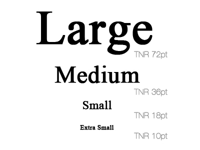 |
3. Color of type This typographic choice is usually dictated to you by the client - they know what color scheme they want and will usually stick to it. You have control over where it is used, and thus can affect the other segments of the typographic grammar. If you use a black on a coloured background, ask yourself if the black stand out, or will it be better in white. It's all about readability and what your eye sees first i.e. ask 'what's the focus?' |  |
Master Tip: How to use Letterform in Your Own Graphic Design....
You don't need to intimately know the myriad of typefaces available. My tip is to keep to a few that you like that have distinct personalities and work in various design contexts. You must have one serif and sans-serif that you will be able to use for just about anything (for me is Minion Pro and Helvetica Neue), but have a small list for more specialised use sorted by category. If I want a nice bold typeface, slightly feminine but strong I go for Rockwell. Anything strongly old-school academic or requires a masculine vintage feel, I tend to set in Baskerville. Pick out your favorites and learn how to use them in different situations and you should be fine.
BONUS: Check out our
Font Logo Generator on BrandCrowd.com.
Written by DesignCrowd on Thursday, September 27, 2012
DesignCrowd is an online marketplace providing logo, website, print and graphic design services by providing access to freelance graphic designers and design studios around the world.
