The letter X has something special about it. It's bold, mysterious, and impossible to ignore. Those two diagonal lines crossing in perfect balance create a visual impact that feels both stable and energetic. It looks like it's marking something important.
Many major brands have chosen X as their visual identity. From gaming companies to fitness brands, these businesses understand that X doesn't sit quietly in a logo. It makes a statement. X brings energy to any design, whether sleek and modern or bold and aggressive. And thanks to a quality logo maker, anyone can achieve that same professional impact.
Let's explore what makes these X logos memorable and why leading brands keep returning to this letter.
The Appeal of the Letter "X" in Branding
The letter X brings unique power to logo design that other letters simply can't match. Two lines crossing at the center create perfect symmetry that's instantly pleasing to look at.
X also carries strong psychological meanings, like the following:
- It marks the spot on treasure maps.
- It represents the unknown in math problems.
- It symbolizes multiplication and growth.
- It suggests intersection and connection.
- It shows crossing boundaries and breaking limits.
X also adapts perfectly to any industry and culture while keeping its distinctive character. Unlike some letters that might mean different things globally, X is universally recognized as a symbol of precision, choice, and marking significance.
Design Elements That Make X Logos Stand Out
The best X logos use the letter's natural strengths while adding creative touches. Here's what makes them exceptional:
- Perfect symmetry creates instant visual harmony. The letter X naturally divides space evenly, giving logos a sense of stability and balance that feels right to viewers. This works exceptionally well for brands wanting to show reliability and strength.
- The crossing point creates energy. That intersection draws the eye and creates movement, even in still designs. Innovative designers use this crossing point as their main focal area. Sometimes they add elements or effects that spread outward from the center.
- Four corners offer creative opportunities. Those triangular spaces around the X provide room for hidden symbols or additional design elements. The best X logos use these spaces without making the design too busy.
- X works with any style. The basic X structure stays strong whether you make it minimal, clean, bold, industrial, elegant, or refined. This flexibility helps X work across different brand personalities.
- Size doesn't matter. X's simple geometric form works perfectly on tiny app icons or massive billboards. No details get lost, and the impact stays strong at any size.
Iconic X Logos
Some X logos have become so famous that they define entire industries. Here are the standout examples showing X at its most powerful:
Xbox
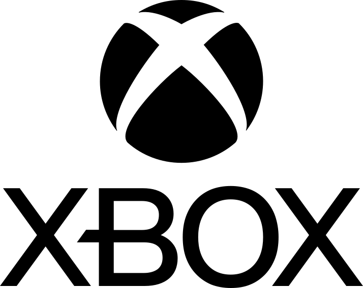
Microsoft's gaming console logo might be the most recognizable X logo today. The sphere surrounding a stylized X communicates technical precision and gaming excitement. The curved elements soften the angular lines, making the logo trendy while keeping its high-tech feel.
The Xbox logo has changed over the years, but the X remains central to the brand. It instantly signals gaming excellence and innovation.
Xerox
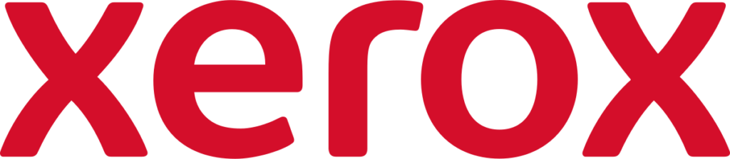
The Xerox logo represents professional corporate design. Clean typography with the X featured prominently shows the company's focus on precision in document technology. The red color adds warmth to what could be a cold, technical brand.
This logo has lasted for decades because it perfectly captures Xerox's role in business technology and efficiency.
X
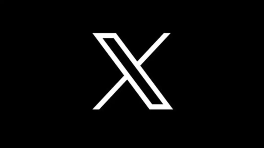
Elon Musk's rebranding of Twitter to X created one of the boldest logo changes in recent history. The simple black X on a white background removes all unnecessary elements and focuses entirely on the power of the letter itself.
This ultra-simple approach makes a statement about cutting through noise and getting straight to the point. It is perfect for a platform built on short, direct messages.
Exxon
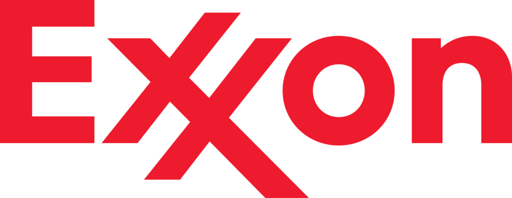
The energy company's logo uses X as part of a longer word, but the double-X treatment makes it central to the brand identity. Bold, industrial fonts reflect the company's role in heavy industry, and the red coloring suggests energy and power.
The Exxon logo shows how X can work with longer brand names while commanding attention.
Xfinity
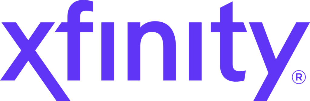
Comcast's telecommunications brand uses a stylized X that flows seamlessly into the company name. The sleek, modern treatment of the X suggests connectivity and crossing digital boundaries. The design implies speed, innovation, and the intersection of various communication technologies.
The X in Xfinity represents the crossing point where entertainment, internet, and communication services meet in one unified user experience.
X Games
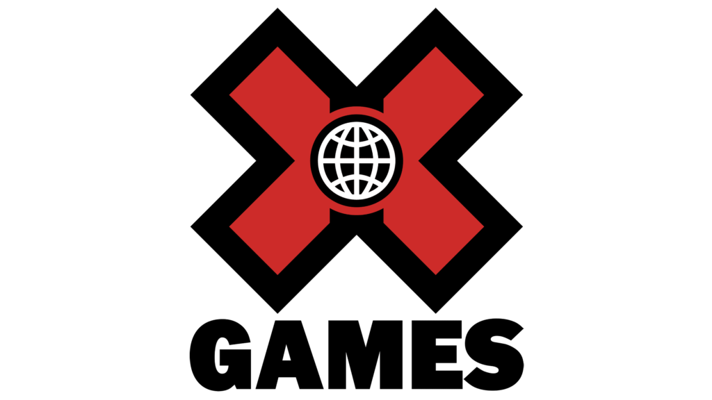
The extreme sports competition features a chunky, bold X at the center of its logo design. The X Games logo has become a well-known symbol of extreme sports and adrenaline-fueled competition. The thick, aggressive styling of the X matches the high-energy, boundary-pushing nature of the sporting events.
This logo shows how X can represent "extreme" in the most literal sense while creating instant recognition in the sports and entertainment world.
X-Men
The superhero franchise logo boldly and distinctively displays the letter X. Over the years, the design has evolved from comic book-inspired graphics to a more minimalist approach emphasizing the X as the core brand element. The X has become as recognizable as any superhero symbol.
The X perfectly represents the "unknown" factor that defines these mutant characters. It suggests mystery, difference, and crossing boundaries between human and superhuman abilities.
The X-Files
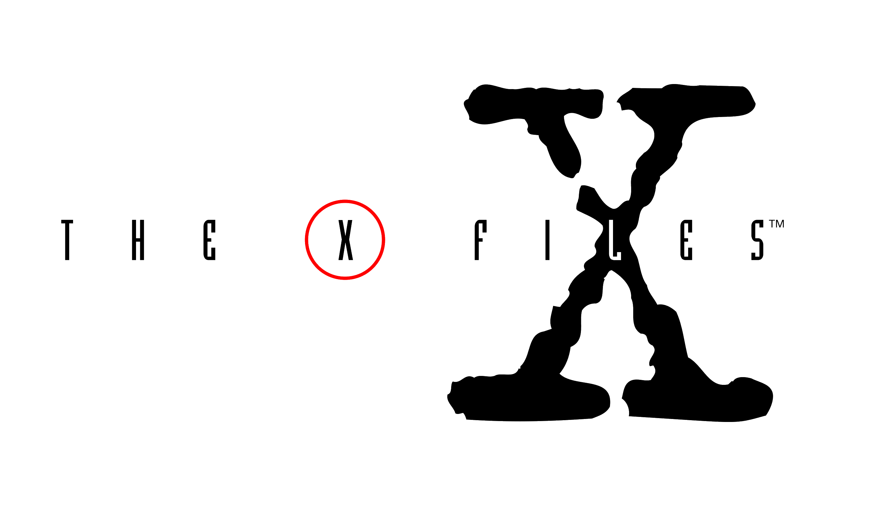
The iconic science fiction series used the X as both a letter and a symbol of mystery. The logo treatments over the years have consistently featured the X prominently, often with dramatic lighting or effects that enhance its mysterious qualities. The X became synonymous with supernatural investigation.
The X represents the unknown, the unexplained, and the crossing into supernatural territory that defines the show's content and devoted fanbase.
TEDx
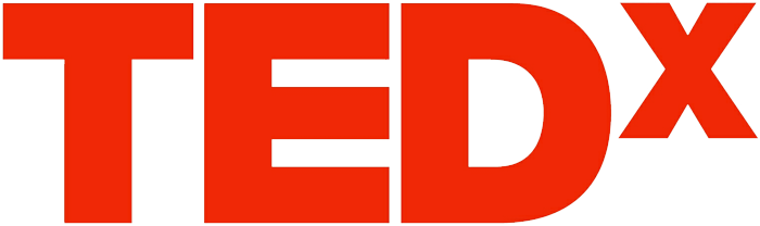
The independent TED event program uses a distinctive red X that has become instantly recognizable worldwide. The bold, sans-serif X stands out dramatically against the simple "TED" lettering, creating a powerful contrast that makes the X feel essential to the brand identity.
The X in TEDx represents local community organizing and the crossing of ideas across different regions and cultures. It shows how one letter can transform a global brand into something more personal and locally connected.
FedEx
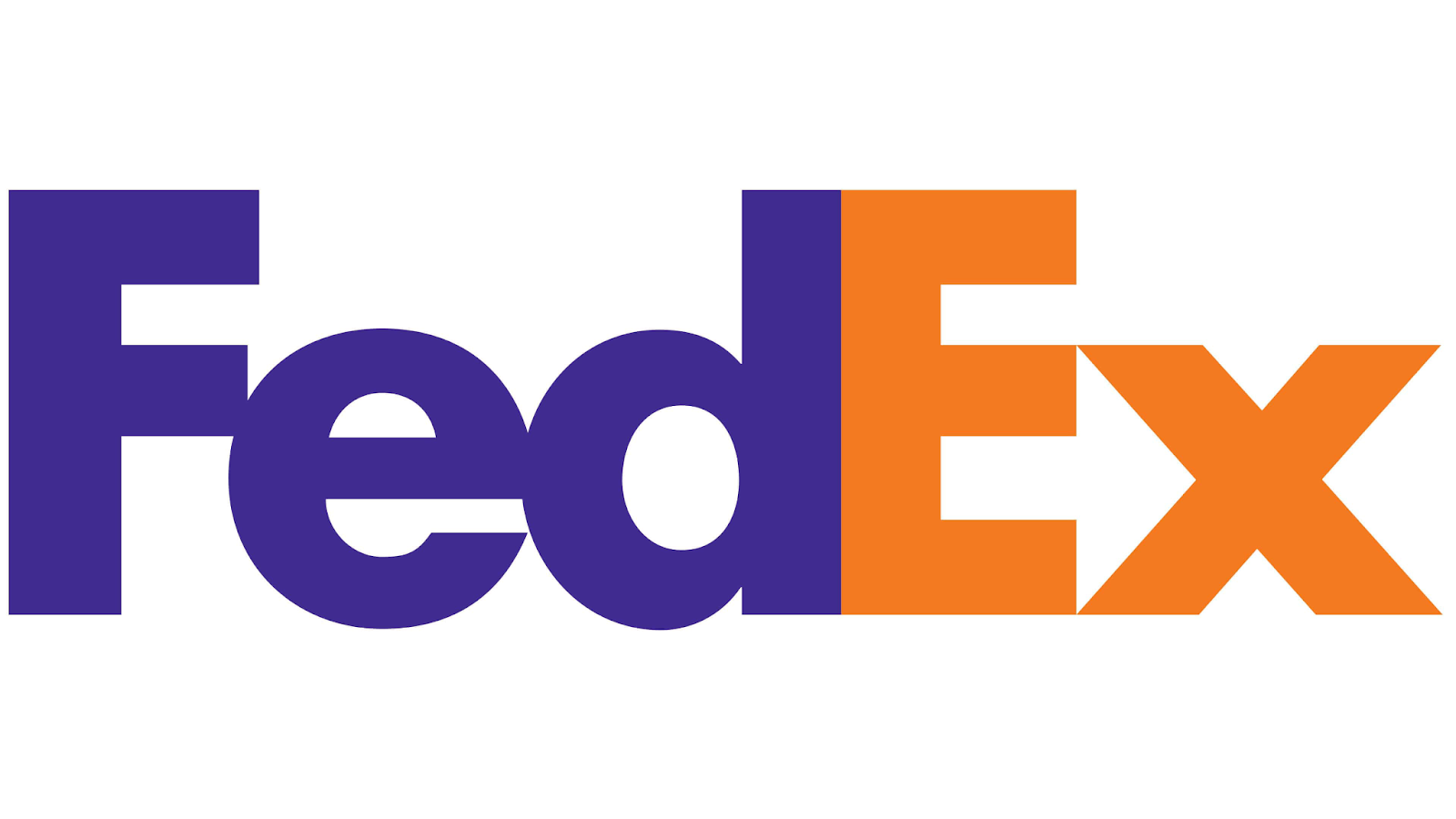
The shipping giant's logo is famous for its clever hidden arrow between the "E" and "x" in the company name. This negative space arrow has become one of the most celebrated examples of clever logo design. The arrow suggests forward movement, speed, and precision in delivery services.
The logo demonstrates how the letter X can work effectively in wordmark designs, contributing to overall brand recognition and clever visual effects through strategic spacing and typography.
X Logos Across Different Industries
Beyond the household names, plenty of creative X logos are making waves across different industries. These designs showcase the versatility and power of X in fresh, innovative ways.
Let’s explore how different industries use it to build powerful, memorable brands.
Tech X Logos
Tech companies frequently use the letter X to represent variables, algorithms, and the unexplored frontiers of technology. It’s a symbol that communicates high-performance design and a spirit of innovation.
The clean, geometric nature of the letter X scales perfectly across all digital platforms and devices. Whether it's a new app or a major gaming platform, these X logos are designed for speed and precision, delivering that cutting-edge tech vibe that says, “The future is here.”
Explore our tech logos below:
Digital Circuit Tech Letter X by BrandCrowd
Futuristic Tech Business by BrandCrowd
Gradient Tech Letter X by BrandCrowd
Studio Brand Letter X by BrandCrowd
Tech AI Letter X by DCOM
Tech Check X by BrandCrowd
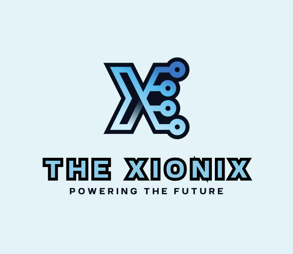
Tech Circuit Letter X by DCOM
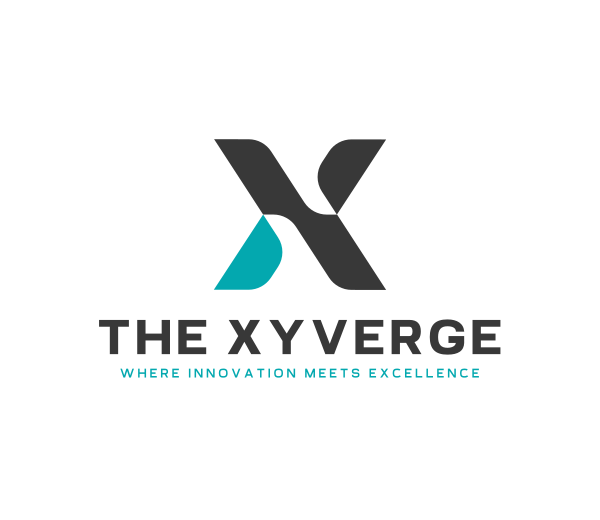
Tech Startup Letter X by DCOM
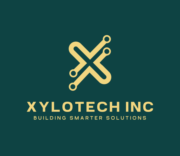
Yellow Letter X Tech by DCOM
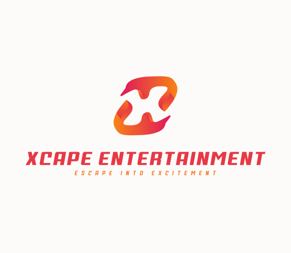
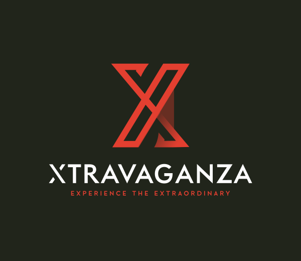
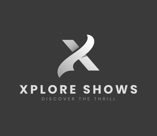
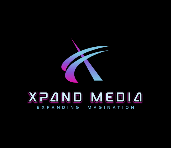
Entertainment X Logos
Lights, camera, X-tion! Entertainment brands use the letter X to create a sense of intrigue and suggest new worlds of storytelling. The design works brilliantly on movie posters, album covers, and streaming platforms, where grabbing attention is everything.
The letter X naturally creates tension and drama in a visual design, making it perfect for brands that promise excitement and unforgettable experiences. Think of it as a bold statement full of energy and mysterious enough to keep audiences returning for more.
Browse our entertainment logos below:
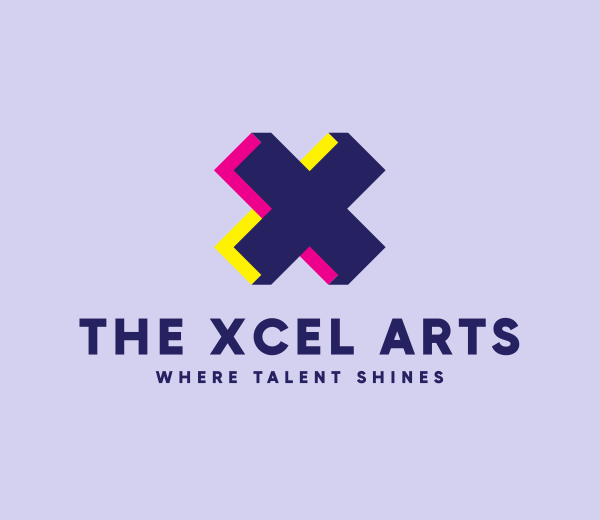
Arcade Gaming Letter X by DCOM
Digital Application Letter X by DCOM
Digital Media Letter X by DCOM
Generic Studio Letter X by BrandCrowd
Geometric Mosaic Letter X by BrandCrowd
Media Digital Letter X by BrandCrowd
Modern Multimedia Letter X by BrandCrowd
Modern Ribbon Advertising Letter X by BrandCrowd
Modern Technology Letter X by DCOM
Sports X Logos
Game on! The letter X perfectly fits sports branding because it represents crossing finish lines, breaking personal records, and pushing beyond your limits. Its symmetrical structure also suggests the balance, coordination, and precision needed for athletic performance.
Whether for extreme sports or your local gym, these X logos are packed with power and motivation. They symbolize strength, determination, and the unstoppable energy it takes to push boundaries and achieve greatness.
Check out our sports logos below:
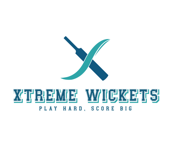
Cricket Bat Letter X by DCOM
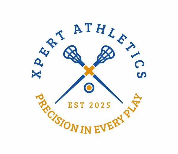
Cross Lacrosse Letter X by BrandCrowd
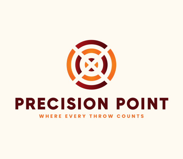
Dartboard Target Letter X by DCOM
Generic Agency Letter X by BrandCrowd
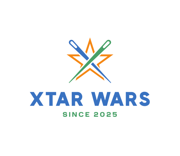
Magic Wand Star Letter X by DCOM
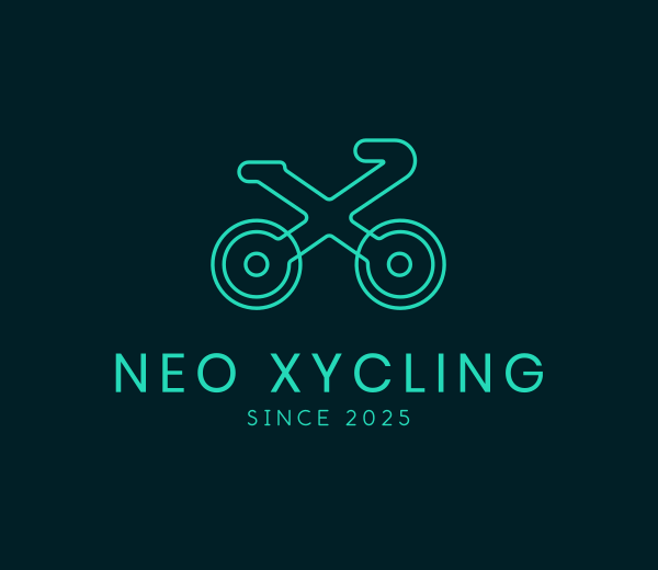
Neon Bike Letter X by BrandCrowd
Professional Agency Letter X by DCOM
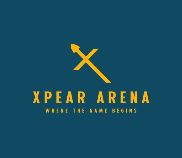
Yellow Spear Letter X by BrandCrowd
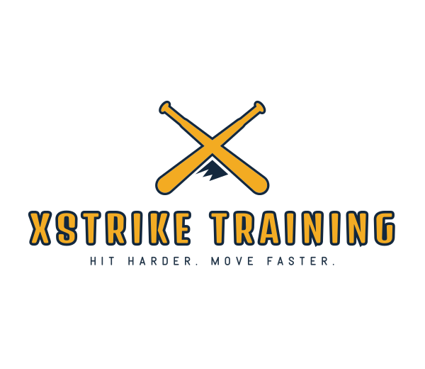
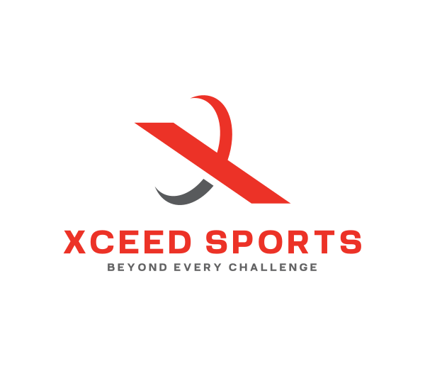
Yellow X Mountain Bat X by DCOM
Tips When Designing X Logos
Creating a successful X logo requires understanding the letter's strengths and avoiding common mistakes. Here are the key guidelines to follow:
Make the intersection your focal point
The crossing point is the most distinctive feature of the letter X. Instead of trying to hide this central point, use it as your primary focus to create visual interest.
To draw the viewer's eye, you can add subtle effects, a splash of color, or a unique graphic element to this natural center. By celebrating the intersection, your logo will feel more intentional and memorable.
Keep perfect balance
The letter X is naturally symmetrical, so any imbalance in the design will be immediately apparent and can make the logo feel unstable. Ensure that both diagonal lines have equal visual weight and thickness.
If you add other elements to your design, distribute them evenly across all four sections to maintain harmony and a sense of professionalism.
Choose line thickness carefully
The thickness of the lines in your X logo can dramatically change its personality. Thin lines create a sense of elegance, precision, and modernity, often seen in high-end or tech brands.
In contrast, thick lines suggest strength, boldness, and stability, making them perfect for sports or industrial brands. Your choice should deliberately reflect your brand's core values and what your audience expects to see.
Use negative space wisely
The four triangular corners created by the X offer unique opportunities for creative design. However, it's important not to feel pressured to fill them just because they're there.
Sometimes, the most powerful X logos are the ones that let the negative space breathe, creating a simple yet striking visual. You can also use this space to subtly embed hidden symbols or secondary elements that add depth to your design.
Test at different sizes
Your X logo must be versatile and maintain its integrity, whether on a tiny social media icon or a large billboard.
Test your design at various sizes early to ensure it stays readable and keeps its visual impact across all uses. A good logo is scalable and looks great no matter the medium.
Avoid predictable concepts
While concepts like treasure maps or literal crossroads are not inherently wrong, they are often expected and can make your logo feel less unique.
To stand out, avoid these obvious ideas and find fresh, innovative ways to use the letter’s symbolic power. The most compelling X logos often take a more abstract or conceptual approach that surprises the viewer and sparks curiosity.
Consider your industry context
Think about how the letter X is typically used within your specific industry. A tech company's X logo might be sleek and digital, while a fashion brand's might be more artistic and fluid.
Use these industry expectations as a starting point, then find ways to stand out from the competition while still fitting into the visual language of your field.
Start Creating Your X Logo Today
The letter X is far more than just a character. This distinctive letter offers built-in balance, natural focal points, and a rich symbolic meaning that few other letters can provide. The most successful X logos don't just use the letter as decoration. They make it essential to the brand story, representing what a company stands for and believes in.
If you’re ready to incorporate the letter X into your logo, DesignCrowd can connect you with thousands of talented designers to create a unique and meaningful logo. For a more hands-on approach, you can use Design.com to design and customize your very own stunning X logo easily.
Your brand's next chapter is waiting to begin. All it needs is an X.
Read more on logo designs here:
Hannah Suroy suroy brings clarity to complex topics across entertainment, business, and creative industries. She specializes in translating industry trends and innovations into engaging content that helps readers understand the creative process behind the work they love.
Artwork by Khim Blazo
Written by DesignCrowd on Thursday, October 2, 2025
DesignCrowd is an online marketplace providing logo, website, print and graphic design services by providing access to freelance graphic designers and design studios around the world.
