Banner ads have a reputation problem. Not because the format is doomed, but because most of what gets shipped looks like it was assembled five minutes before launch.
The fix usually isn’t “make it louder.” It’s the opposite: make it clearer, calmer, and more intentional—so the ad reads like a confident piece of design, not a shouting rectangle.
If you’re staring at a set of sizes and wondering how to make them feel modern without turning them into fake “native” content, this checklist is for you.
You’ll end up with ads that earn attention by being easy to understand, easy to scan, and hard to misunderstand.
Start With the “Truth in One Glance” Rule
Before you touch color or typography, decide what the ad must communicate in 1–2 seconds. That’s not a marketing slogan. It’s the minimum a scrolling human needs to make sense of what they’re seeing.
A simple way to force clarity is to write your “truth” in a single sentence, then cut it down:
- First pass: “20% off running shoes this weekend only.”
- Better: “20% off this weekend.”
- Best: “20% off. Ends Sunday.”
Now check it against what your ad is allowed to do. “Doesn’t scream ‘ad’” should never mean “tries to pass as something else.”
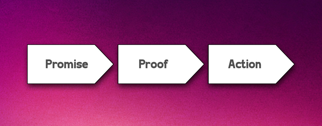
Once your message is clean, build a hierarchy that supports it. A good banner can usually be described as three layers:
- The promise: the core offer or benefit.
- The proof: a detail that reduces doubt.
- The action: what happens next.
Here’s a concrete example for a meal kit brand in a 300×250:
- Promise: “Dinner in 15 minutes.”
- Proof: “First box 40% off”
- Action: “Pick your plan”
If your first draft has five promises, three proofs, and two actions, you don’t have a banner. You have a landing page that got squeezed.
When you’re designing for real distribution, you’ll also want to think about where these units show up. Platforms such as PropellerAds deliver creatives across a wide range of placements, so a calm, high-contrast hierarchy matters more than cleverness. Your job is to make the message survive the messy real world.
Build a Layout System That Survives Every Size
Designers get trapped when they treat each banner size like a separate project. You’ll move faster—and ship more consistent work—if you build a small “ad layout system” and apply it across sizes.
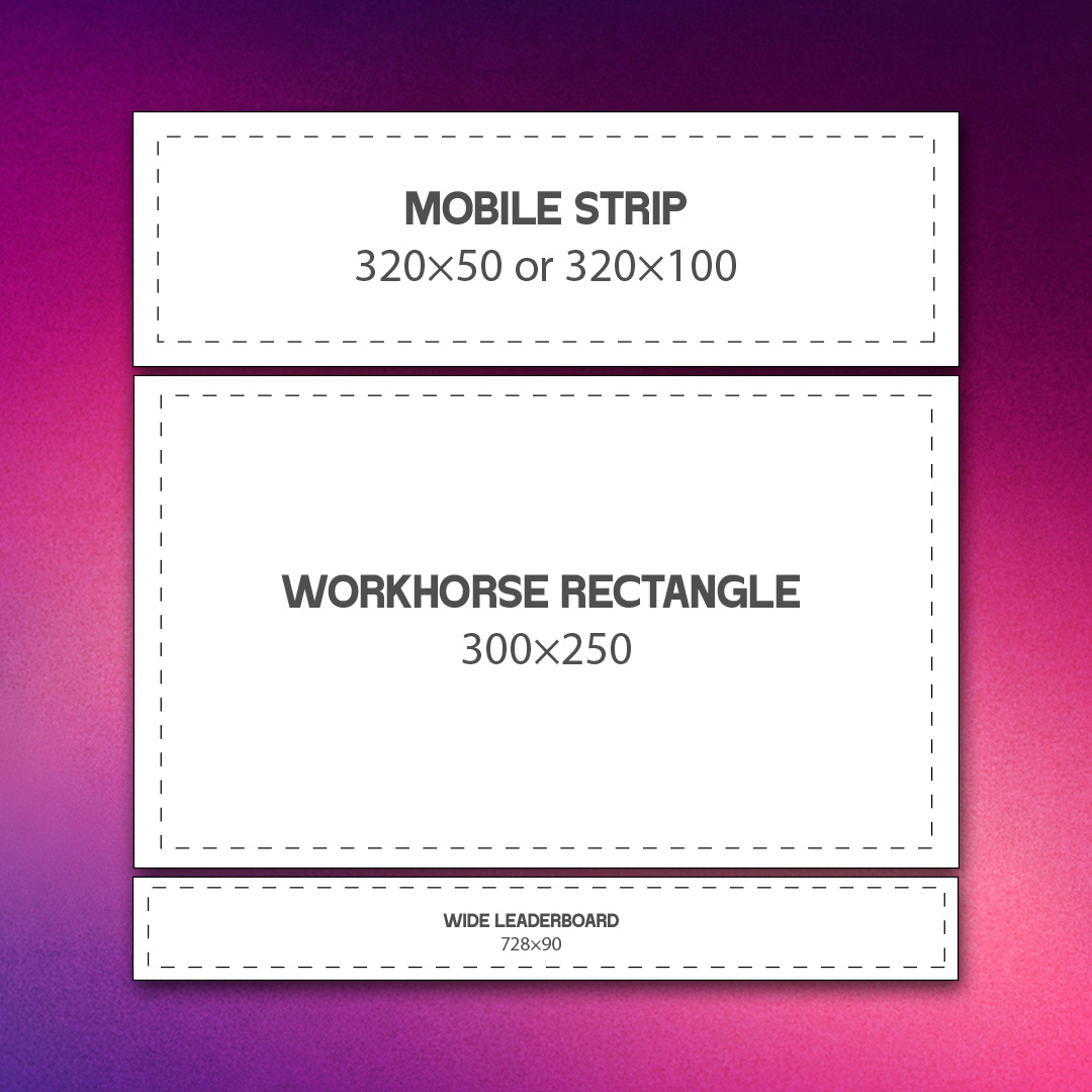
Start with a size trio that covers most of your headaches:
- Mobile strip: 320×50 or 320×100
- Workhorse rectangle: 300×250
- Wide leaderboard: 728×90
Pick one “base” size, usually 300×250, and design it first. Then adapt, don’t recreate.
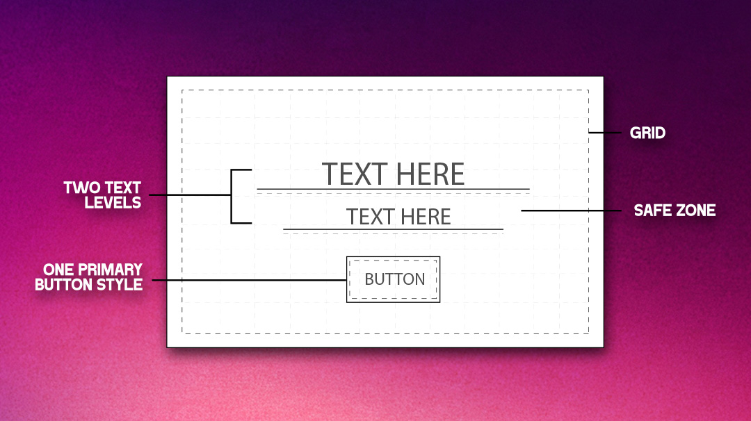
A practical system that holds up:
- Grid: 8px spacing increments inside the ad.
- Safe zone: keep key text at least 12–16px away from edges.
- Two text levels: headline + one supporting line, max.
- One primary button style: same shape and contrast everywhere.
Example workflow detail that saves hours: create three component blocks—Logo, Message, CTA—and treat them like movable tiles. On 728×90, the tiles go left-to-right. On 320×50, they stack as “Message + CTA,” and the logo becomes a tiny mark or drops entirely.
You’ll be tempted to cram everything into the small sizes. Don’t. Decide what gets sacrificed.
A clean rule: in mobile strips, drop the proof line first, not the CTA. “Free shipping” is nice, but “Shop now” is what makes the format function.
If you need a reality check for how clean system-based ads can look, compare your current set to curated examples in a category feed like DesignCrowd’s banner ad design area, and then take notes on what repeats across strong concepts. You’ll notice the same patterns: one idea, strong spacing, readable type.
Production guardrails that prevent “why does this look cheap?”:
- Export at the right weight: keep vector type crisp when possible, and don’t let JPEG artifacts touch your text.
- Avoid micro text: if it’s under ~12px in the final output, treat it as decorative, not informative.
- Plan for truncation: if your headline must wrap, design a two-line version intentionally.
One more thing: don’t “design to the center” only. Some placements crop or pad in ways you don’t control. Your ad should still make sense if it loses a few pixels on an edge.
Make it feel designed, not assembled
This is where ads usually start screaming. Not because the colors are bright, but because the choices don’t relate to each other.
Three upgrades make banners instantly more modern:
1) Typography with restraint
Pick one type family and use weight for hierarchy. If your headline is bold and condensed, your support line should be regular and calmer.
Example: a webinar ad in 300×250.
- Headline: “Hire faster in 30 days”
- Support: “Live demo • Thursday 11am”
- Button: “Reserve a seat”
If you add italics, underlines, and a second font to “make it pop,” it won’t pop. It’ll vibrate.
2) Color that does one job
Your palette should have roles:
- Background: neutral or brand tone
- Text: high contrast
- Accent: used once, for the button or key figure
This approach is rooted in understanding color psychology, where each color is used intentionally to guide attention and evoke the right response. If your brand color is loud, don’t flood the entire background. Put the loud color where you want the eye to land.
3) Imagery that earns its space
A stock photo with vague smiling is rarely doing real work. If the image doesn’t explain the offer, it should support the mood without competing.
A useful test: cover the image with your hand. Does the ad get clearer or worse? If it gets clearer, the image is decoration, and you can simplify.
Designers also forget how much trust is communicated by tiny details:
- Align edges cleanly.
- Use consistent corner radii.
- Keep shadows subtle or skip them entirely.
- Don’t mix three different icon styles in one unit.
If you’re trying to match ad creative to an existing brand, start by pulling the logo rules and spacing cues from a source of truth. Even a quick scroll through logo design examples can remind you what “consistent” looks like across different visual languages. Then translate those cues into your ad components.
A compliance note that also improves quality: clear labeling and honest framing tend to create a cleaner design. When you don’t rely on trickery, the layout has to do its job, and the result feels more confident.
Test like a designer, not like a slot machine
Most banner feedback loops are too vague. “Make it stand out” isn’t a brief. It’s anxiety.
Instead, test one variable at a time, and decide what “better” means before you change anything.
A simple, realistic testing plan for a small team:
- Variant A: current ad
- Variant B: same ad, but shorter headline
- Variant C: same ad, but proof line swapped for a specific number
- Variant D: same ad, but CTA changed from a verb phrase to an outcome phrase
Concrete example for a subscription app:
- Verb CTA: “Start free trial”
- Outcome CTA: “Try it free for 7 days”
You’re not testing “design.” You’re testing comprehension and motivation.
CTA language is one of the easiest wins because it’s often the only interactive-looking element in the unit. In HubSpot’s guidance on CTAs, the consistent theme is clarity: people click when they understand what they get and what happens next. That’s a design principle as much as a copy principle.
Also, don’t ignore placement context. A banner can look beautiful and still fail because it doesn’t match the mindset of where it appears. A “limited time” retail offer might work in a fast-scrolling environment, while a B2B report download might need a calmer, more informative proof line.
If you want to make your testing less subjective, define three “scan questions” and judge each variant against them:
- What is this?
- Why should I care?
- What happens if I tap?
If any answer requires reading tiny text, the ad depends on effort. Effort loses.
One last practical guardrail: keep a small “banner QA checklist” at the end of your workflow. Five minutes here prevents embarrassing mistakes:
- Spelling and date accuracy
- CTA is visible at 100% zoom and in a quick scroll
- Logo spacing consistent
- Contrast is strong enough for the background
- Offer terms not hidden in unreadable microcopy
If you’re handling broader brand assets at the same time as ads, it helps to keep your production pipeline consistent across formats. A general creative queue like DesignCrowd’s graphic design space can be a useful reference for how teams bundle deliverables without losing consistency across touchpoints. The point is to treat ads as part of the system, not an afterthought.
Wrap-up takeaway
Banner ads stop “screaming” when they stop trying to do everything at once. Get the truth clear in one glance, then build a hierarchy that makes that truth impossible to miss. Treat your sizes like a system, not a pile of separate files, and you’ll ship faster with fewer messy compromises. Make typography and color do one job each, and you’ll feel the quality jump even before you test.
Written by DesignCrowd on Wednesday, April 1, 2026
DesignCrowd is an online marketplace providing logo, website, print and graphic design services by providing access to freelance graphic designers and design studios around the world.
